
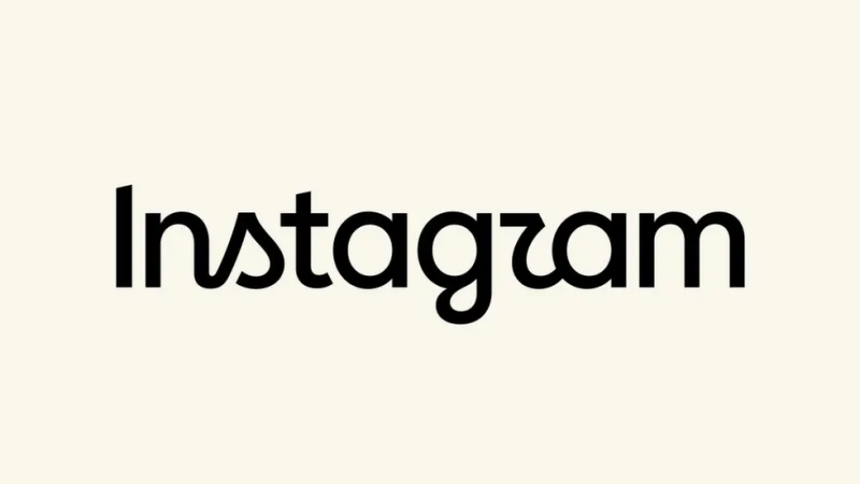
Instagram introduced a fresh text-only logo on Thursday, giving its iconic brand name a subtle design update. Executive leadership at the social media giant decided the previous typography felt old after spending more than ten full years sitting inside the app interface.
Instagram chief Adam Mosseri broke the news directly to followers across his official Instagram and Threads accounts. Mosseri explained that design teams refined the classic typography to look sharper and more contemporary while preserving the simple layout that users recognize instantly. He highlighted that updating classic brand assets requires balancing fresh visual style against iconic original elements.
Changing a globally recognized brand mark always triggers strong reactions from the public. While many online users naturally resist changes to familiar apps, early feedback online shows a mix of critique and praise. Plenty of design fans complimented the updated lettering, calling the new font choice a clean refresh that helps the app look current.
Other users quickly turned the visual update into internet memes. Some commenters joked that the stylized letter “r” makes the text read like “Instagzam” at first glance. However, because Instagram is one of the most recognizable brand names on the planet, everyday users will spot the famous name instantly regardless of minor letter flourishes.
The new font style brings back classic cursive handwriting traits, adding rounded curves to letters like “s,” “r,” and “g.” The artistic choice creates an interesting design contrast today, especially since younger smartphone users rarely learn or practice traditional script handwriting in school. Some younger viewers joked online that the unique shape on the “s” looks less like traditional handwriting and more like a small sailboat or a stylized figure eight.
This update represents the biggest visual brand adjustment for Instagram since 2016. Eight years ago, the platform famously retired its classic brown camera icon with the rainbow accent stripe, replacing it with the bright pink gradient camera glyph that sits on phone home screens today.
Meta representatives have not confirmed whether this typography refresh will lead to broader interface updates down the road. For now, users will see the updated wordmark rolling out across app splash screens, marketing materials, and official web pages.
Updating brand typography keeps visual platforms fresh as digital design trends shift. By refining its classic cursive script instead of abandoning it for a generic modern font, Instagram keeps its personality intact while updating its look for a new decade of mobile users.